Frontend Without a Framework | Behind the Scenes of The M.Akita Chronicles
This post is part of a series; follow along with the tag /themakitachronicles. This is part 4.
And be sure to subscribe to my new newsletter The M.Akita Chronicles!
–
There’s an obsession in the market that frontend = React. Or Vue. Or Svelte. Or the framework of the week. What if I told you it’s possible to have a modern, responsive frontend with dark mode, email-compatible, multi-platform — without a single line of JavaScript framework?
I’m not talking about static sites from the 2000s. I’m talking about Tailwind CSS v4 on Rails, Hugo with the Hextra theme for the blog, and email templates that work from Gmail to Outlook 2016. All in the same project, with one developer.
Tailwind CSS v4: The End of Handcrafted CSS
I have a confession: CSS has always been my kryptonite. Not because it’s hard — but because it’s unpredictable. You change a margin-top and break the layout of a page you never touched. Cascade, specificity, inheritance — it’s a minefield.
Tailwind solves this in the most pragmatic way possible: utility classes right in the HTML.
<div class="flex items-center gap-4 p-6 bg-white dark:bg-gray-800
            rounded-xl shadow-sm border border-gray-200 dark:border-gray-700">
  <img class="w-12 h-12 rounded-full" src="/images/avatar.jpg">
  <div>
    <h3 class="font-semibold text-gray-900 dark:text-gray-100">Título</h3>
    <p class="text-sm text-gray-500 dark:text-gray-400">Descrição</p>
  </div>
</div>
“But this is just inline style with extra steps!” — No, it isn’t. It’s a design system with constraints. You don’t pick “margin: 17px” — you pick m-4 (16px) or m-5 (20px). That constraint forces visual consistency without needing a design system documented across 40 pages.
And Tailwind v4, which came to Rails via tailwindcss-rails, has a fundamental change: CSS-first configuration. No more tailwind.config.js. Everything is CSS:
@import "tailwindcss";

@theme {
  --color-brand: #8b5cf6;
  --font-sans: "Inter", system-ui, sans-serif;
}
One less config file. One less build step. Simpler.
Dark Mode: Respect Your User
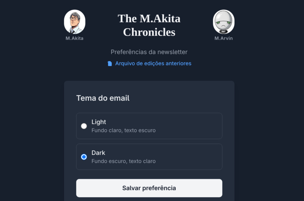
Something that deeply annoys me is a site that ignores the operating system’s theme preference. The user set dark mode on the OS — respect that.
With Tailwind, dark mode is trivial:
<body class="bg-white dark:bg-gray-900 text-gray-900 dark:text-gray-100">The dark: prefix applies the style when the operating system is in dark mode (via prefers-color-scheme: dark). No JavaScript needed. No toggle needed. No cookie needed. It works.
But “it works” is the bare minimum. The real challenge is maintaining consistency across dozens of components. Every color you use needs a dark: variant. Every background, every text, every border.
The trick: create conventions and follow them. Main background? bg-white dark:bg-gray-900. Primary text? text-gray-900 dark:text-gray-100. Secondary text? text-gray-500 dark:text-gray-400. Borders? border-gray-200 dark:border-gray-700. With 4-5 pairs defined, 90% of components are covered.
Hugo + Hextra: Blog Without a Database
The project’s blog runs Hugo with the Hextra theme. Hugo is a static site generator written in Go — absurdly fast. A full rebuild in <500ms even with dozens of pages.
What makes Hextra special is that it’s a documentation theme adapted for blogs. Navigation sidebar, integrated search, table of contents — everything ready. And customizable via partial layouts:
layouts/
├── _partials/
│   ├── custom/
│   │   └── head-end.html          # Injects analytics, fonts, custom CSS
│   └── section-box.html           # Shared partial (DRY, see below)
├── blog/
│   └── home.html                  # Custom homepage
├── newsletters/
│   └── single.html                # Individual newsletter template
├── podcast-transcripts/
│   └── list.html                  # Episode listing
└── shortcodes/                    # 17 shortcodes — components without JS
    ├── podcast-turn.html          # Speech bubble in the transcript
    ├── akita-comment.html         # Akita's comment
    ├── marvin-comment.html        # Marvin's comment
    ├── history-timeline.html      # Historical events timeline
    ├── market-ticker.html         # Financial tickers table
    ├── market-map.html            # FinViz S&P 500 map
    ├── subscribe-cta.html         # Subscription call-to-action
    ├── score.html                 # Relevance badge (high/medium/low)
    ├── holidays.html              # Holidays and commemorative dates
    ├── ref-stories.html           # Reference links
    ├── book-downloads.html        # Book download links
    ├── hacker-news.html           # ┐
    ├── anime-ranking.html         # │ Section boxes — delegate to
    ├── youtube-digest.html        # │ section-box.html (see below)
    ├── world-events.html          # │
    ├── market-news.html           # │
    └── qa.html                    # ┘
Each content type has its own template. Newsletters have a navigation sidebar and visual sections. Podcast transcripts have an embedded player and dialogue formatting. The same Markdown content is rendered differently depending on the type in the frontmatter.
Shortcodes: Components Without JavaScript
Hugo shortcodes are the equivalent of React components, but without a build step:
<!-- layouts/shortcodes/podcast-turn.html -->
{{ $speaker := .Get "speaker" }}
{{ $isAkita := eq $speaker "akita" }}

<div class="podcast-turn" style="display: flex; {{ if $isAkita }}flex-direction: row{{ else }}flex-direction: row-reverse{{ end }};">
  <img src="/images/{{ $speaker }}.jpg"
       style="width: 40px; height: 40px; border-radius: 50%;">
  <div class="bubble {{ if $isAkita }}akita-bubble{{ else }}marvin-bubble{{ end }}">
    {{ .Inner | markdownify }}
  </div>
</div>
In Markdown, the author writes:
{{< podcast-turn speaker="akita" >}}
Então, vamos falar sobre o que aconteceu essa semana no mundo tech...
{{< /podcast-turn >}}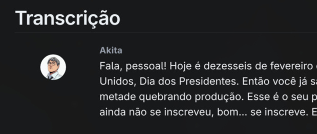
And Hugo renders a styled chat bubble, with avatar, correct alignment, and processed markdown. Zero JavaScript. Zero framework. HTML + CSS + template logic.
DRY With a Shared Partial
With 17 shortcodes, duplication becomes a problem fast. Seven of them — the “section boxes” that wrap newsletter sections (Hacker News, Anime, YouTube, etc.) — have the same visual structure: icon, title, colored border, Markdown content. Only the color and label change.
The solution is a shared partial that takes parameters:
<!-- layouts/partials/section-box.html -->
<div class="section-box {{ .class }}">
  <div class="section-box-header">
    <span>{{ .icon }}</span> {{ .label }}
  </div>
  <div class="section-box-content">{{ .content | markdownify }}</div>
</div>
And each shortcode becomes a one-liner:
<!-- layouts/shortcodes/hacker-news.html -->
{{ partial "section-box" (dict "class" "hacker-news" "icon" "🔒" "label" "The Hacker News" "content" .Inner) }}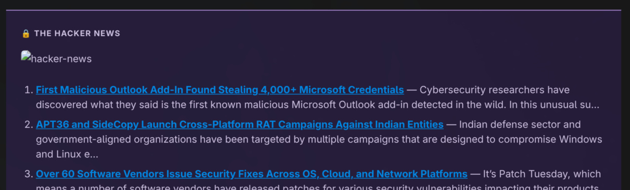
It’s the Hugo equivalent of component inheritance: a polymorphic partial parameterized by dict. The CSS in custom.css defines colors per class (.hacker-news, .anime-ranking, etc.) with light/dark variants. Result: 7 shortcodes that used to have duplicated HTML are now 7 lines + 1 partial + CSS.
But there’s a crucial catch: shortcodes are exclusive to Hugo. The same content that goes to the blog also goes out by email. And email doesn’t understand shortcodes.
The Challenge: Same Content, Two Renders
Here’s the central frontend problem in this kind of project: the same Markdown file needs to work in two completely different contexts.
On the blog (Hugo):
- Shortcodes work (
\{\{< subscribe-cta >\}\}) - CSS with classes (Tailwind, Hextra)
- Dark mode via
prefers-color-scheme - Responsive images
- Flexible layout
In email (Rails → Amazon SES):
- Shortcodes are dead text — they have to be removed
- CSS must be inline (many email clients ignore
<style>) - Dark mode? Forget it for 80% of clients
- Images with absolute URLs and fixed size
- Layout with
<table>(yes, in 2026)
The solution: two independent rendering pipelines. The Markdown content is the source of truth. Hugo transforms it for the web. Rails transforms it for email. Each one with its own rules.
On the Rails side, the MarkdownToHtml service needs to:
- Process standard Markdown
- Convert
\{\{< shortcode >\}\}into equivalent HTML or strip them — via aSHORTCODE_PATTERNShash that maps each shortcode to a regex + inline template with CSS - Apply the theme (light/dark based on the subscriber’s preference)
- Inject inline CSS for email client compatibility
- Rewrite image URLs to absolute
It’s more work than it sounds. Each shortcode needs an email-safe equivalent. Comment avatars need absolute URLs. Sections with colored backgrounds need <td style="background-color:..."> instead of CSS classes.
Email HTML: The Worst Frontend in the World
If you think cross-browser compatibility is hard, try cross-email-client compatibility. Outlook 2016 renders HTML using the Microsoft Word engine. Yes, Word. That’s not a joke.
The survival rules:
- Layout with
<table>.display: flex?grid? They don’t exist in Outlook. - Inline CSS on every element.
<style>tags are ignored by several clients. - No
marginon images. Usepaddingon the parent<td>. - Web fonts don’t work. Use a font stack:
font-family: -apple-system, BlinkMacSystemFont, 'Segoe UI', sans-serif; - Themes are a subscriber preference, not automatic detection — many email clients don’t reliably support
prefers-color-scheme.
The project’s email template is an ERB that takes theme variables:
<td style="padding: 8px 28px; color: <%= @theme[:text] %>;
           background: <%= @theme[:card_bg] %>;">
  <%= raw @content %>
</td>
The theme defines all the colors:
THEMES = {
  light: {
    text: "#1a1a1a",
    card_bg: "#ffffff",
    link_color: "#7c3aed",
    # ...
  },
  dark: {
    text: "#e6edf3",
    card_bg: "#161b22",
    link_color: "#a78bfa",
    # ...
  }
}
Each subscriber picks their theme at signup time. The email is rendered with the correct colors for that person. No media queries, no automatic detection — because email clients don’t support it reliably. It’s simpler to give the user the choice.
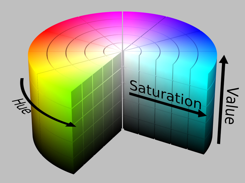
Color Palette: HSL and the Science Behind the Choices
“But how did you pick these colors?” — Not by eyeballing it. There’s a science behind it, and it’s called HSL (Hue, Saturation, Lightness).
Most developers think about color as hex (#e8eef8) or RGB (rgb(232, 238, 248)). Those are machine formats — useful for rendering, useless for designing. When you look at #3b50a2 and #c93030 side by side, there’s no way to intuitively know if they’ll work together. They’re just numbers.
HSL solves this. Instead of mixing light channels (Red, Green, Blue), you describe color in human terms:
- Hue: the position on the color wheel, from 0° to 360°. Red = 0°, green = 120°, blue = 240°.
- Saturation: how “vivid” the color is. 0% = gray, 100% = pure color.
- Lightness: how light or dark. 0% = black, 100% = white.
With HSL, you control each dimension independently. And that’s where building the palette comes in.
Step 1: Distribute Hues Around the Color Wheel
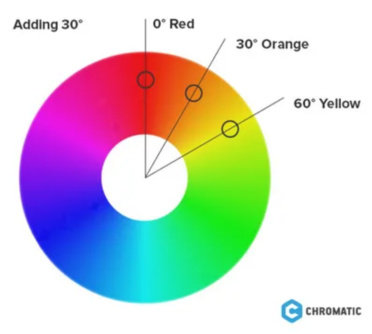
The newsletter has 8 section types, each with its own color. For all of them to “belong” visually to the same project, the hues are distributed evenly around the 360° wheel:
| Section | Hue | Degrees |
|---|---|---|
| YouTube | Red | 0° |
| History | Sepia | 35° |
| World | Amber | 45° |
| Book/Downloads | Green | 140° |
| Holidays | Teal | 180° |
| Anime/Q&A | Blue | 210° |
| Market News | Royal | 225° |
| Hacker News | Purple | 270° |
Eight hues spaced around the wheel. That’s not random — it’s the same logic as a polychromatic palette in color theory. When hues are equidistant, the human eye perceives harmony even with completely different colors. It’s the same principle artists have been using with a 12-color wheel since the 18th century.
Step 2: Lock Saturation and Lightness Per Layer
Here’s the trick that makes it all work together. Each visual “layer” (background, text, border) has fixed saturation and lightness — only the hue changes:
Light theme:
- Backgrounds: ~92-95% lightness, moderate saturation. With lightness that high, even different saturations result in pastel colors with similar visual weight — no section “screams” louder than another.
- Text: ~15-20% lightness. Dark enough to guarantee >7:1 contrast ratio against the light background (above the WCAG AAA minimum of 7:1).
- Borders: ~45-55% lightness. The chromatic accent — visible but not dominant.
Dark theme:
- Backgrounds: ~10-12% lightness. Uniform depth — every section has the same “darkness”.
- Text: ~80-85% lightness. Light enough for >6:1 contrast ratio on the dark background.
- Borders: same lightness range as in the light theme — they work as accents in both contexts.
In practice, this means generating the dark variant of any color is mechanical: keep the hue, invert the lightness. A background that was 94% becomes 11%. Text that was 18% becomes 83%. That’s not design — it’s arithmetic.
Step 3: Check Contrast (WCAG)
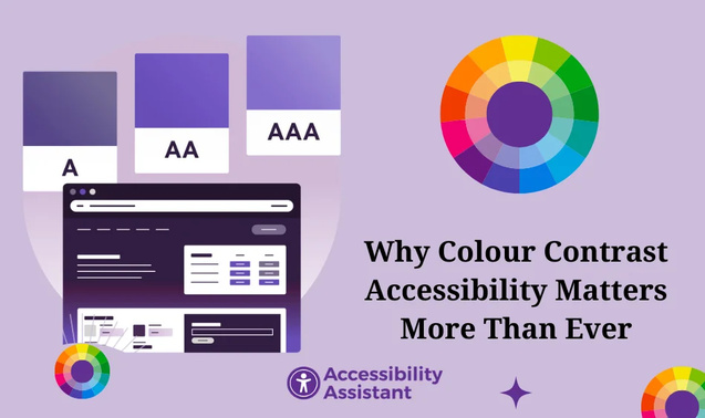
Pretty colors nobody can read are worthless. The WCAG standard (Web Content Accessibility Guidelines) defines minimum ratios:
- AA: 4.5:1 for normal text, 3:1 for large text
- AAA: 7:1 for normal text, 4.5:1 for large text
The light backgrounds at ~95% lightness against text at ~20% lightness give a ratio >7:1 — WCAG AAA. The dark backgrounds (~11%) against light text (~82%) give >6:1 — comfortably WCAG AA, near AAA.
This isn’t altruism. Low-contrast email is harder to read, generates less engagement, and in extreme cases is flagged by email clients’ accessibility filters.
The Result
When you open the newsletter and see the Hacker News section (purple), followed by YouTube (red), followed by Anime (blue) — they look like “the same project” despite being completely different colors. That’s HSL at work: different hues, same saturation, same lightness. The eye perceives coherence without knowing how to explain why.
And the best part: adding a new section is trivial. Pick a hue that isn’t taken on the wheel, apply the same saturation/lightness rules per layer, and the new section automatically “belongs” to the existing design.
# The comment in the code sums up the rules:
# - Hues evenly spaced: blue 210, green 140, sepia 35, amber 45, royal 225, purple 270, red 0, teal 180
# - Light backgrounds: ~95% lightness, ~25% saturation
# - Light text: ~20% lightness (>7:1 contrast ratio on light bg)
# - Dark backgrounds: ~10-12% lightness
# - Dark text: ~80-85% lightness (>6:1 contrast ratio on dark bg)
# - Borders: ~45-55% lightness
Six rules. Eight hues. Two themes. 100% deterministic. Zero subjective “I think this blue looks pretty” decisions — it’s a design system derived from geometric properties of the HSL color space.
Well-Formed HTML: The Spam Filter Nobody Tells You About
Everything I described above — tables, inline CSS, font stacks — solves the rendering problem. But there’s a second reason to follow these rules that most developers ignore: email providers analyze the quality of your HTML to decide if it’s spam.
Gmail, Outlook, Yahoo — all of them run your email’s HTML through heuristics before showing it to the user. Malformed HTML is one of the classic spam signals. It makes sense: spammers don’t test templates. They spit out broken HTML generated by cheap mass-mailing tools. If your email looks like spammer output, it gets treated as spam.
The signals that trip filters:
- Unclosed or improperly nested tags. A
<div>that opens and never closes, or a</td>before the</tr>, is an immediate flag. Providers expect HTML that parses without errors — not HTML “that the browser fixes up”. - Unbalanced image-to-text ratio. An email that’s basically a giant image with little text? Classic spam. Providers want to see real text — not text inside images. The rule of thumb is to keep at least 60% text, 40% images.
- Missing
altattribute on images. Beyond accessibility, an empty or missingaltis a sign of carelessness — and carelessness correlates with spam. Every<img>needs a descriptivealt. - CSS that hides content.
display: none,visibility: hidden,font-size: 0, text the same color as the background — those are classic keyword stuffing techniques. Even if you use them legitimately for responsive email, the filter doesn’t know the difference. - Excessively heavy HTML. An email with 500KB of HTML raises suspicion. Keep it light — the actual content rarely needs more than 100KB of HTML.
- Links with text that doesn’t match the href.
<a href="https://site-real.com">https://site-falso.com</a>is textbook phishing. Even subtle discrepancies (domain in the text different from the domain in the link) are penalized.
The point that ties it all together: the same practices that make email render correctly in Outlook are the ones that keep your emails out of spam. Tables with clean structure? Well-formed HTML. Inline CSS on every element instead of hacks with <style>? No hidden CSS. Images with explicit dimensions and alt text? Legitimate content.
It’s no coincidence. Email providers calibrated their filters by watching what spammers do — and spammers do exactly the opposite of well-built HTML email. When you follow best practices for compatibility, for free you’re also signaling legitimacy to spam filters.
The practical lesson: treat your email’s HTML as if it were an XML document. Validate, test, and make sure every tag opens and closes in the right order. Use tools like Email on Acid or Litmus to test in multiple clients — they also report spam scoring issues. And resist the temptation to copy ready-made templates from the internet without validating them — many are a disaster of malformed HTML that slips past Gmail but gives Outlook a heart attack and gets Yahoo’s spam filter to flag you as suspicious.
RSS Feeds: The Forgotten Frontend
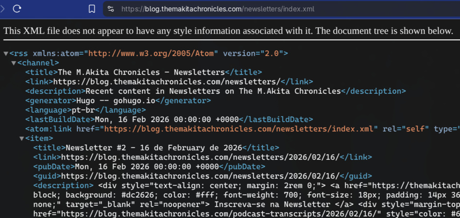
A detail web developers ignore: RSS is a frontend. Podcasts on Spotify and Apple Podcasts are consumed via RSS. The feed needs:
- Valid XML (podcast parsers are strict)
- Complete metadata (title, description, duration, file size)
- Image URLs that actually work (Spotify validates them)
- Cover art with minimum dimensions (1400×1400 for Spotify)
- Unique GUIDs per episode
Hugo generates RSS automatically, but the default template doesn’t have the fields podcast platforms require. A custom template with iTunes tags is necessary:
<itunes:duration>{{ .Params.duration_seconds }}</itunes:duration>
<itunes:image href="{{ .Params.cover_image | absURL }}"/>
<enclosure url="{{ .Params.audio_url }}"
           length="{{ .Params.file_size }}"
           type="audio/mpeg"/>
The Philosophy: Content First, Framework Never
The pattern that emerges from this whole setup is: content is sovereign. Markdown with YAML frontmatter is the universal format. Each frontend (blog, email, RSS, podcast player) consumes the same content and renders it its own way.
There’s no “React component that fetches data from an API”. There’s a Markdown file read by whoever needs it. This is radically simple — and radically powerful. Swap the blog engine from Hugo to something else? Change the templates, the content stays the same. Swap the email provider from SES to Sendgrid? Change the mailer, the templates stay the same.
It’s the Unix philosophy applied to frontend: each tool does one thing well, connected by a universal format (Markdown + YAML).
Conclusion
You don’t need React to have a modern frontend. Tailwind v4 gives you a design system with constraints, native dark mode, and zero JavaScript. Hugo gives you an absurdly fast blog with flexible templates. ERB with inline CSS gives you emails that work in any client.
The real investment is understanding the constraints of each platform and building rendering pipelines for each one. The payoff comes from that, not from learning the trendy framework that’ll die in 18 months.
At the end of the day, the best frontend abstraction is none at all. HTML, CSS, and Markdown. Simple, debuggable, and going to work 10 years from now.